


As the lead UX designer on the ResMed website redesign project, I knew I had a challenge.
While the content was informative, the overall experience felt dated and uninspiring.
The website lacked the vibrancy needed to capture the attention of individuals seeking information about sleep apnea and its treatment options.
The primary goal?
To transform their blog section, notorious for its overwhelming length and lack of visual appeal.
Diagnosing the Problem:
The initial website assessment was a sobering experience.
Usability testing revealed a user interface that felt static and uninviting.
Navigation was a complex, and the sheer volume of text on the blog section overwhelmed visitors.
It was clear that the website wasn’t effectively connecting with its audience.
Crafting a User-Centric Solution:
Knowing the pain points, I knew I needed to create a website experience that was not only informative but also visually engaging and user-friendly.
Here’s how my UX redesign journey unfolded:
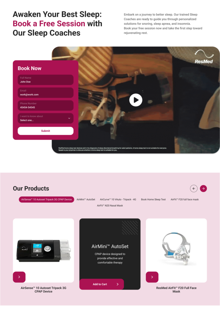
Content Chunking & Hierarchy
The blog section needed a complete overhaul.

Gone were the days of endless text blocks.
I restructured the content into digestible chunks, incorporating visuals like infographics and explainer videos to break up the text and enhance understanding.
Creating a clear hierarchy of information – prioritizing the most crucial details – ensured users didn’t get lost in a sea of words.


Visual Appeal & Navigation
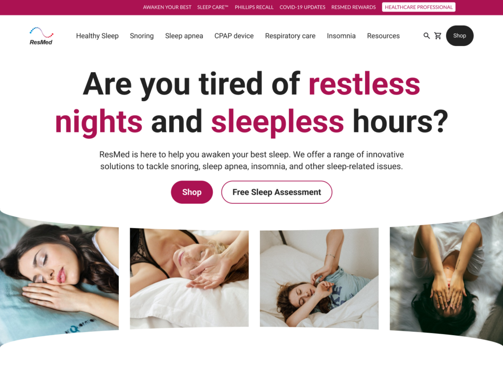
The entire website received a visual refresh.
I implemented a clean, modern design that aligned with ResMed’s brand identity.
High-quality images and a user-friendly color palette replaced the previous bland aesthetic.
Intuitive navigation tools, like clear menus and well-placed search bars, empowered users to quickly find the information they needed.
Breathing New Life into Sleep Apnea Resources:
The redesigned ResMed website, particularly the transformed blog section, proved to be a success story. Here are some key takeaways:
Engaged Users
Gone were the days of high bounce rates.
Users spent more time exploring the redesigned blog, actively engaging with the content and visuals.
Improved Navigation
The intuitive navigation system eliminated user frustration, allowing visitors to find the information they needed quickly and easily.
Stronger Brand Identity
The cohesive design language and clear messaging solidified ResMed’s position as a leader in sleep apnea solutions.
The Takeaway
My UX redesign journey for ResMed demonstrates the power of user-centric design principles.
By prioritizing user needs and focusing on clarity, engagement, and accessibility, I was able to transform the website into a valuable resource for individuals seeking information about sleep apnea.
This case study serves as a testament to the effectiveness of a well-executed UX redesign, even when undertaken by a single designer.

